ADAM is About Advanced Design and Manufacturing with Information Technology, and Cyberspace Product and Service Reviews in our Virtual Exhibition Hall, Including the Latest News, the Most Innovative International Products & Services, New Strategies, R&D, and more...
Logo and Symbol Design Using Adobe Photoshop (ver. 7) on the Mac
by
Gregory N. Ranky
Computer Graphics and Biomedical Engineering Review Editor, ADAM with IT
Website: http://www.cimwareukandusa.com
Email: cimware@cimwareukandusa.com
Introduction
The main use for Adobe Photoshop involves the use of manipulating color, lighting, and textures for artistic or photographic purposes. In addition, it is possible to design logos and symbols using this package. The geometric logo in this article is an example of this.
Design Process
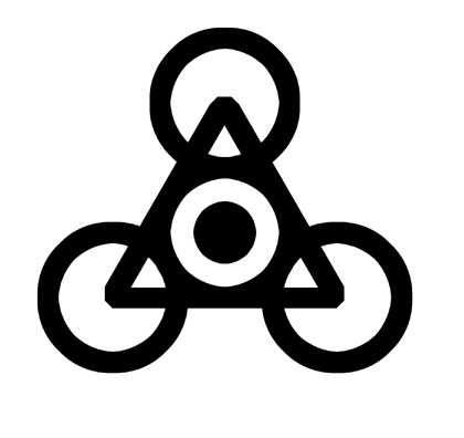
The design began with a circle, which can be created using the Marquee tool and then filled with a color (in this case black). Black is recommended for the shape of logos as it is easily visible.
Then the selection was cut into a ring. To do this, it is recommended that the selection is duplicated onto a new layer, and then contracted, after which the contracted shape is selected, and the selection is deleted on the original circle. In addition to keeping backup files of images, it is also useful to keep duplicate layers within the same file in order to make changes if needed. The basic shapes are usually kept.
Transforming the selection is more effective than the expand/contract function, as for circles, the expanded or contracted shape is closer in shape to an octagon, and this distortion is magnified if used continually.
In order to properly gauge the width of the ring, a small colored square selection approximately close to the width was created in the center. These layers were aligned using the lock feature, visible as a chain symbol.
When a layer is locked, it will move with the active (eye logo) layer. Aligning the shapes relative to each other is done using the move tool, in which the locked layers will move relative to the active layer.
The shape was zoomed into, and the square was shift-dragged vertically so that it could be aligned to the topmost point of the ring, and was then shrunk to fit the width. The circle was duplicated and dragged vertically so that the widths would be aligned. This selection-consisting of two rings-was flattened and then duplicated twice.
Each duplication was rotated 120° in one direction, and then aligned using the square as a guide. A triangle was then created, and aligned with the horizontal edge at the bottom. The interior circle on each of the outer rings was selected separately, and the selection was shrunk on a layer to determine the center of each ring.
The triangle was resized so that the points were aligned with the ring centers, and a similar process to the circles was done, leaving a triangular ring the same width as the circular rings. The edges were rounded by rotated selections, and the rounded triangle then expanded by the ring width.
The resulting shape consisted of four circles, which was selected with the magic wand tool and expanded by the same number of pixels as its width, making it three times as thick.
The center circle was duplicated and contracted by the same width as the larger rings, and the finished shape was flattened. (See image below).
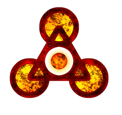
The coloring on this shape made use of layers and their properties.
For the different texture uses, the center orb, the framework, and an expanded version of each of the three outer circles were on separate layers. The main frame was first given a rusted texture, set to normal, and the layer above it was given a red gemstone texture set to multiply. This darkened and clarified the edges of the shape.
The three outer spheres were given a corroded texture, with the color balance and hue/saturation set closer to yellow and orange. The glow was too faded originally, and so the layer was duplicated, with the top set on multiply. It is important to note that any layer property setting except normal will change if the layer is flattened. A general rule of thumb is to keep the layers separate until the image is ready to be flattened, as if a layer is merged down, it will acquire the properties of the layer beneath.
The central orb was originally given a corroded texture similar to the outer circles, then a layer with a gradient from bright yellow to tan was created above and set to multiply.
Another layer above was given an orange-yellow neon texture, and was set to overlay, with opacity reduced from 100% to 60%. Overlay and multiply both retain or increase the saturation of the colors beneath, although overlay gives brighter variations, with multiply giving darken ones.
As illustrated below, the final image was flattened and the brightness/contrast adjusted to give clear colors and forms.
Summary
The above illustrated images are good examples of what Adobe Photoshop can be used for what can typically be considered the domain of vector graphics, showing the versatility of this powerful package.
(All trademarks acknowledged). (Review by Gregory N. Ranky, Technical Review Editor).